Inside Scoop of the NEW 8-Inch Clairvoyant Dunny by J*RYU

Want to know more about the new Clairvoyant 8-Inch Dunny by J*RYU? We have answers….

What was your inspiration for The Clairvoyant 8-inch Dunny?
The Clairvoyant was conceived at the same time as the upcoming Arcane Divination 3″ Dunny series, and thus, needed to fit tonally into the concept of that series’ theme of tarot and mysticism. It seemed fitting that the larger dunny platform would be perfect as a centerpiece for the smaller designs, and from there, we knew that a fortune teller concept would be perfect to coalesce everything together. After submitting a few different concepts, Kozik and the Kidrobot design team picked what would eventually become the Clairvoyant. In addition to the eventual final design, some of the other designs I submitted were of a “Zoltan” type of fortune teller (like from the movie “Big” as well as a hooded and veiled female fortuneteller that was sculpted as a relief on the front of the form, with intricate constellation-type elements. Ultimately in retrospect, we made the right design decision – despite the difference in size between the Clairvoyant and the 3″ series, they all share a similarity in feel and execution, which was a critical aspect for me in ensuring a cohesive link between the two releases.
Can you explain the design elements of this release?
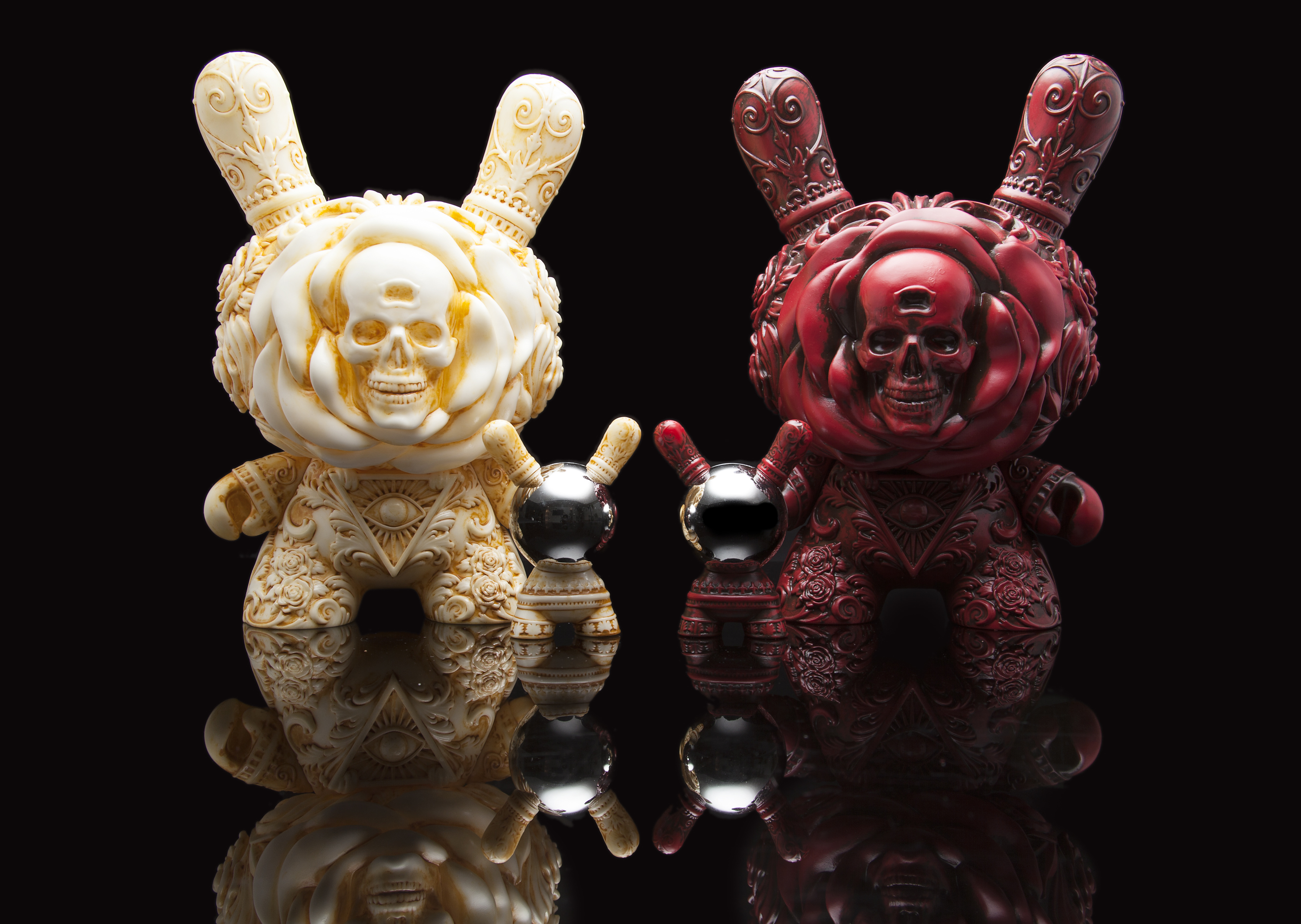
There are many symbolic elements that I tried to incorporate into this piece while keeping in mind that I wanted it to be a spritual successor to the “It’s a F.A.D.” that was released last year. Sticking with the gothic style that I incorporate into much of my work, I wanted it and the FAD to be complimentary but at the same time, have the Clairvoyant be a natural evolution in terms of the the sculpt. With the concept of fortune telling and divination in mind, I made an attempt to bring together multiple ideas and forms into one complete idea.
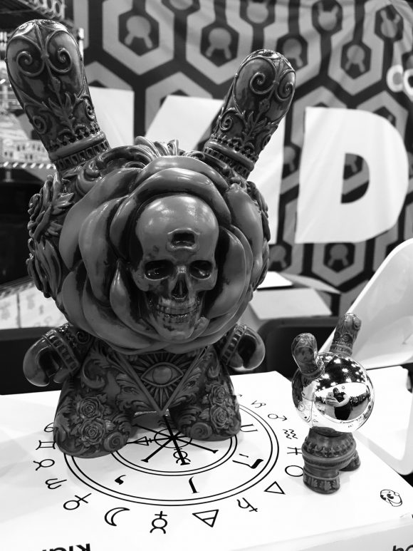
The skull nestled amongst the petals of a blooming flower symbolizes the notion that as humans, the point in which we feel we have enough wisdom and experience to make sense of our lives, it is usually near the end. The ears and arm designs featuring wrought iron decorative elements frame a garden of flowers, symbolizing the notion that we try to make sense of our futures within the constraints of conventional and societal thinking..The Eye of Providence-type of symbol on the belly is reference to often relying on divine insight or faith. The snake eating it’s own tail on the back (Ouroboros), represents the introspection of one’s self and the cyclical notion of man’s quest for meaning. The icons and runes on the back of the head are traditional symbols associated with tarot and divination, tying into the 3″ series. Lastly, the motto I adopted for the two projects – “Live on time, emit no evil”, is featured on the back. The phrase is a palindrome and can be read forwards and backwards, and basically encapsulates a simple answer to those who seek meaning in the unknown – make the best use of the time you have in your life and don’t do harm .
In terms of the color choices, I wanted to pay tribute to my cultural heritage and their deep ties to fortune telling/divination and thus picked paint applications that were reminiscent of Chinese statues. Thus, there is an ivory and a rosewood, two out of the three most frequent types of materials that are often seen in traditional Asian art. The paint applications were done really well and I was quite happy with the results.
What was the most difficult aspect of creating this release?
I think that the most difficult aspect was getting the petals around the skull as delicate as possible, which was not very easy because the technical constraints of how vinyl is produced as well as the positioning of these elements prevented it from being as thin as I envisioned. However, once we received the first prototype samples I was able to see that it still turned out quite nice and I was very happy with the results.
I want to acknowledge and give thanks to the design and development teams at Kidrobot, who were incredibly open and accommodating with trying to replicate my design into a production-ready form, not an easy task given the amount of details in the piece. We went back and forth tweaking this and that, and in the end, I am incredibly pleased with how it turned out and thankful to the team for ensuring that my design was produced accurately and faithfully.
What does the future hold for upcoming J*RYU releases?
The companion series to the Clairvoyant, Arcane Divination, featuring Camilla d’Ericco, Godmachine, Jon-Paul Kaiser, Tokyo Jesus and myself, is due to be released in April. This series has 14 unique designs, 2 chase colorways, and some special fun extras. I am extremely proud of everyone involved, from the artists to the team at KR, I feel that we really pushed the boundaries of how far a dunny can be redesigned but still retain the iconic look and feel. This series has it all – sculpting, accessories, glow-in-the-dark, metallic paints, flocking, translucent elements, washes, and the biggest horns ever seen on a 3″ dunny. I cannot wait for people to see this series!
In addition, I will be concentrating on two major gallery shows and attending conventions in 2017. I would love to work with Kidrobot again so if the collectors out there enjoy the Clairvoyant and the Arcane Divination series, please make sure to let us know and tag #kidrobotknowsthefuture in your social media posts! Beyond that #frankkozikknowsthefuture….
What is a fun fact about yourself?
I am a huge fan of the game Marvel Puzzle Quest on my phone and my in-game user name is ALittleOldLady because I thought it would be especially humorous for my opponents to lose to ALittleOldLady. Yes, I am a huge nerd.

The post Inside Scoop of the NEW 8-Inch Clairvoyant Dunny by J*RYU appeared first on Kidrobot Blog.
